 I am guilty.
Whether it is because I am an utter design enthusiast or because I have such a small attention span that I tire looking for books – I want them to jump out and hit me in the face; make a statement – the simple truth cannot be avoided, however guilty it makes me feel. I judge books by their covers.
Although I am entirely certain that not every person who reads a book has the same mind-set as myself, I am sure that I am not alone in this treacherous act.
I will not read a book if it’s cover does not attract my attention (90% of the time).
If you’re staring at these words in utter horror, allow me to set the scene:
I am in a bookshop with twenty minutes on the clock. Around  me, all I can see are stacks and stacks of books. Where do I start? Surely I should start in the section that most interests me, right? So, my eyes wander, scouring the bookshelves for the sign indicating that the young adult, the self-help, the tips of writing, the mystery fiction, or the design orientated books are there. Finally, I find my chosen section. I find success in the fact that I have just cut down this massive book shop by approximately 96%, alas, there are still hundreds – if not thousands – of books here. I have just over ten minutes left and, determined to find a book, I have to pick up the first book that’s spine grabs my attention. Or else, how am I supposed to decide where to start?
Let me ask you a question and be entirely honest with me: which book, not knowing what either is about, would you rather read?

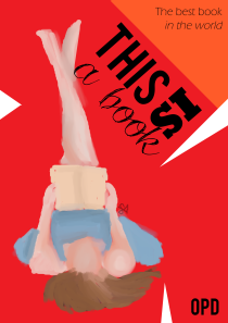
Assuming that you all said the book on the right, let’s diagnose exactly what is wrong with the book on the left…
- First off, Comic Sans. This is a crime when it comes to design. Comic Sans should not be used in any case unless teaching children under the age of five how to write (and even then, there are better fonts to use) or as a joke. Read this. Now. Have you read it? Good, then you may proceed.
- Layout is everything. If a book cover does not have a compelling layout, it will look unorganized and tacky. You have to think about the size of each element, where they best fit on a page, and, perhaps most importantly, padding. Padding refers to the amount of blank space surrounding a main image or text before it reaches the edge of the paper.
- Spelling mistakes. For the love of God, use spell-check. A book with spelling mistakes on the front won’t sell because, let’s be honest, what is that going to say about the rest of the book?
- So plain. I am an utter minimalist; I completely believe that things need to be simple and clean to look fresh and attractive, however, there are situations where minimalism is not the way to go. When a book cover looks like this, this is one of those situations. That being said, it’s important not to over crowd, either
Now, the book cover on the right is not at all perfect. In fact, it’s not even good. It took me ten minutes, max, and it is totally reflected. That being said, it is a significant improvement to the prior cover. Let us evaluate:
- Image is extremely important. You don’t have to be good at drawing (or have a fully configured graphics tablet, like I currently don’t) or have access to money or stock images. Shapes can also count as images. As long as the book is a) not overcrowded and b) not too simple, you’re good to go.
- Font is vital. You can see the difference in the fonts I used on the second cover and how them improve the overall design of the cover.
- Colour. I don’t know why I chose the colour red; it’s horrible for working with book covers but, alas, I did and so I stuck with it. That being said, variations of colour are also important.
Do you judge books by their covers? What do you think makes a good book cover? Do you even pay attention to book covers? Let me know your thoughts in the comment section below and please share, like or rate this post if you liked it. I am grateful for any and all support received!


Share Your Thoughts, Leave a Reply